Plots
Chapters
Frequency Distributions
Frequency Distributions
Frequency
The frequency of an event is how often it occurs.
Example
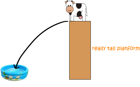
Alice the cow is up to her dare-devil circus tricks again. This time she's learning to jump of a really high platform, with the hope of landing in an inflatable kiddy-pool. As you can imagine, she doesn't manage to land in the pool every often.
She lands in the pool
- Twice on Monday
- Once on Tuesday
- Three times on Wednesday and
- Five times on Thursday
Frequency Distribution Table
We can count how many times each score occurs in a list of data and collect them together in a frequency distribution table.
Example
Here is a list of how many times Alice has landed in the wading pool over the past fortnight:
| Number of Landings | Frequency |
|---|---|
| 1 | 2 |
| 2 | 3 |
| 4 | 2 |
| 5 | 2 |
| 6 | 2 |
| 7 | 4 |
We can use this table to determine all sorts of interesting things about our data. For example,
- The most common number of landings made by Alice was 7
- She achieved most numbers of landings twice.
A frequency distribution table lists all the possible values that occur in a data set and how many times they occur (their frequencies).
Example
Sam's maths teacher gives his class a weekly pre-test to see how well they understand the background material required for the next topic. Here are Sam's marks on the tests for the first 12 weeks of the year:
| Test Mark | Frequency |
|---|---|
| 12 | 1 |
| 13 | 0 |
| 14 | 1 |
| 15 | 0 |
| 16 | 2 |
| 17 | 4 |
| 18 | 2 |
| 19 | 0 |
| 20 | 2 |
We can also group Sam's marks into different ranges. In the table below, each range is a group of 3 marks. The frequency is the sum of the frequencies for the marks in each range.
| Mark Range | Frequency |
|---|---|
| 12-14 | 2 |
| 15-17 | 6 |
| 18-20 | 4 |
You can read more about grouping values in frequency distribution tables in the article on grouped frequency distributions.
Graphing Data
Creating a frequency distribution table is a good first step in displaying your data graphically. Once your data is tabulated, you can choose to display it using a number of different methods including pie charts, bar charts and line graphs. You can read more about these methods in the article on displaying your data.
Description
In these chapters you will learn more about
- Histograms
- Scatter plots
- Stem and leaf plots etc
these lessons are for students studying maths in Year 10 or highter
Audience
Year 10 students or higher, however, suitable for Year 8+ students too.
Learning Objectives
Learn about plotting
Author: Subject Coach
Added on: 28th Sep 2018
You must be logged in as Student to ask a Question.
None just yet!