Plots
Chapters
Histograms
Histograms
Histograms, which are similar to bar graphs, provide you with a nice visual way to display data. A histogram is made up of columns of
different heights. Each column
represents data in a different range. The heights of the columns tell you how many different people or objects have scores in each range. Histograms
give a really quick way of telling which range of data is the most common,
which range is the least common, and which ranges include more scores than which other ranges.
When you construct a histogram, you need to think about the ranges that you break your data up into. Let's have a look at some examples of histograms.
Baby Elephant Food Consumption
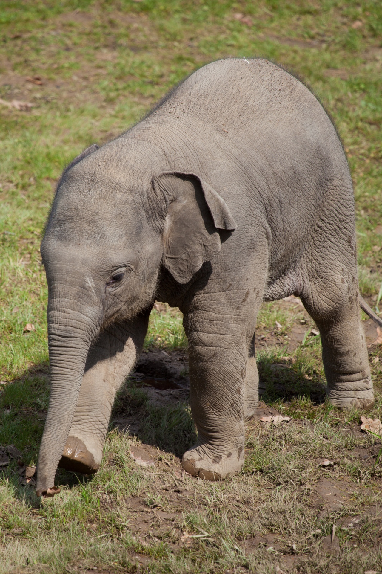
Elephants eat a massive amount of food - up to 300 kg per day. Baby elephants start eating solid food including leaves, roots and bark at around 4 months of age, but continue to drink an incredible amount (about 40 litres) of their mother's milk each day until they are around 10 years old. Let's look at the food consumption of a baby elephant, Sharnee, over a month. Sharnee is 5 months old.
I've decided to break the data up into the following groups:
- 94 kg to just under 96 kg
- 96 kg to just under 98 kg
- 98 kg to just under 100 kg
- and so on.
Here is the histogram:
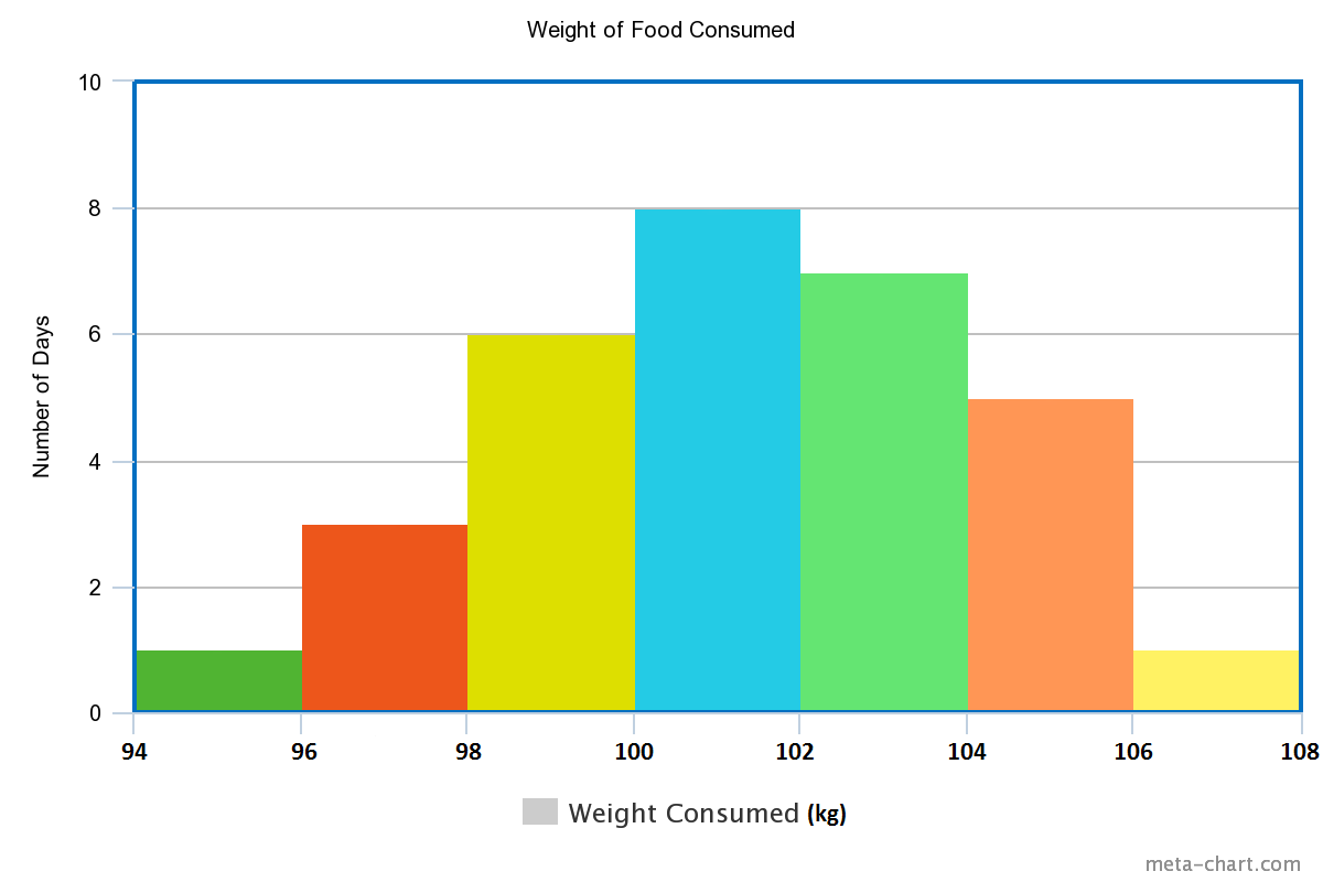
It is easy to see from the bar chart that she ate between 100 and just under 102 kg of food on 8 days.
Notice that the horizontal axis is labelled like a numberline? That's because the weight of food eaten can take on any values between 94 kg and 108 kg. This is continuous data.
Penguin Height

A group of scientists has decided to record the heights of a colony of emperor penguins in Antarctica. They obtain heights in the range from 1 metre to 1.4 metres, and decide to divide their data up into the following groups:
- 1.0 metres to just under 1.05 metres
- 1.05 metres to just under 1.1 metres
- 1.1 metres to just under 1.15 metres
- and so on.
Here's their histogram
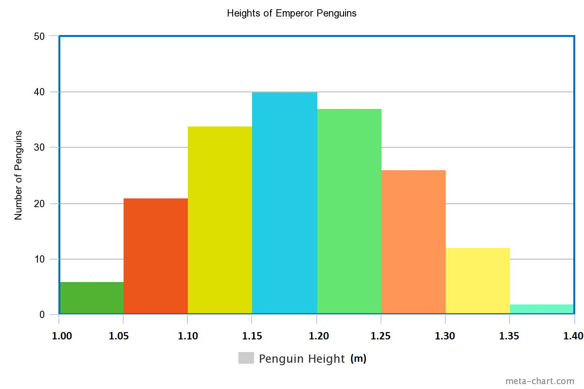
The range of each bar in the histogram is called the class interval. In this example, the class intervals are all 0.05. Sometimes a class can be empty. We represent empty classes by a space.
Histograms and Bar Charts
At first glance, histograms and bar charts appear to be the same thing. However, there are differences. If you look at the two examples below, you'll notice that there are gaps between the columns of a bar chart, and no gaps between the columns of a histogram.
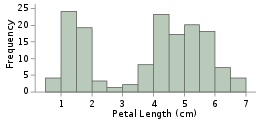
Histograms, like the one on the left, are useful for displaying continuous data, like the lengths of Iris petals, the heights of penguins, or the weights of food consumed by a baby elephant.
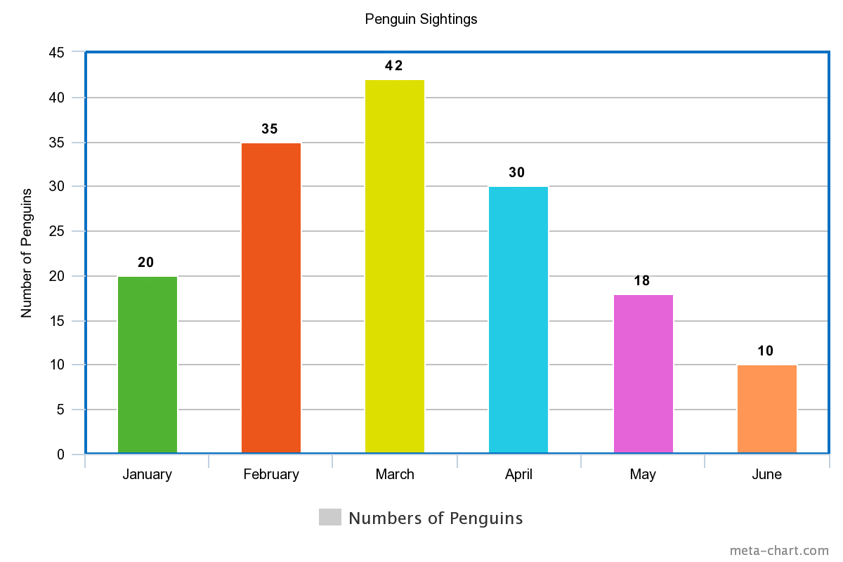
Bar charts, like the one on the right, are useful for displaying data that can be grouped into different categories such as months, different types of vegetables, or numbers of penguins sighted.
Conclusion
Histograms provide us a with a great way of displaying continuous data. This can include:
- weights
- heights
- times
- speeds
- etc.
An important type of histogram is a frequency histogram. The columns of a frequency histogram (like the iris petal length histogram above) show how many
times a certain score (or range of scores) occurs in a data set. We'll talk more about frequency histograms in the articles on frequency and cumulative frequency.
Description
In these chapters you will learn more about
- Histograms
- Scatter plots
- Stem and leaf plots etc
these lessons are for students studying maths in Year 10 or highter
Audience
Year 10 students or higher, however, suitable for Year 8+ students too.
Learning Objectives
Learn about plotting
Author: Subject Coach
Added on: 28th Sep 2018
You must be logged in as Student to ask a Question.
None just yet!