Grids with CSS calc() function
Chapters
CSS calc() function to create HTML grids
You have been using grid frameworks such as bootstrap, blueprint etc and one of the reason, you are using them is for creating responsive Grids on your webpage. Nothing wrong with that, but it takes so many HTML tags to create such grids. Sometimes we think, what if there exists a better way? A way that offers flexibility to set gutter margins between floated grid containers.
CSS calc() is one better way to create our grid in a much friendlier and effiecient way. With low code manageability it definitely offers an edge.
What is calc() function? Mozilla developer network article defines calc as:
“With calc(), you can perform calculations to determine CSS property values.” - MDN
Thats not the only part for the calc() function, we can be much more formal and add units to our calculations.
An example is
div.w50 { width: calc(50% - 40px) }
Above example is perfectly valid and offers flexibility to introduce 20px margins for elements with class w50.
Lets jump into creating a grid using a calc() function.
Our Markup
<div>
 <img src="http://placehold.it/350x150" alt="" />
 <img src="http://placehold.it/350x150" alt="" />
 <img src="http://placehold.it/350x150" alt="" />
 <img src="http://placehold.it/350x150" alt="" />
 <img src="http://placehold.it/350x150" alt="" />
</div>
Our CSS
img{
 float:left;
 width: calc(25% - 30px);
 margin:15px
}
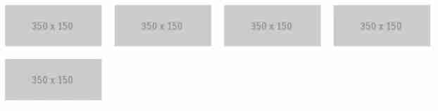
Here is our output
There is another way to put our rule up
img{float:left;width: calc((100% *1/4) - 30px);margin:15px}
You can also define CSS rules for different media queries, as shown below
img {
  float: left;
  margin: 15px;
  width: calc(100% * 1 / 4 - 30px);
}
@media (max-width: 1024px) {
  img {
    width: calc(100% * 1 / 3 - 30px);
  }
}
@media (max-width: 768px) {
  img {
    width: calc(100% * 1 / 2 - 30px);
  }
}
@media (max-width: 480px) {
  img {
    width: calc(100% - 30px);
  }
}
A working example if hosted on CodePen and it can be found below.
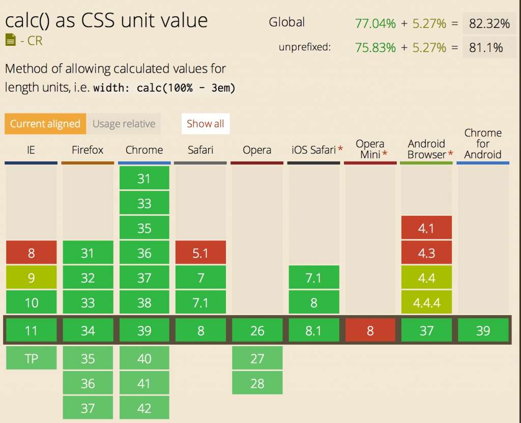
When using CSS we have to very concious of browser support because many new or old property does not work across different browsers, luckily that's not the case with calc() function. Below image shows support for calc() in different browsers.
Hopefully you will find this useful. Leave your comments in, if you have any feedback for this tutorial or would like to add something to it.
Resources
Description
In this tutorial we will learn on how to use CSS calc() function to create a grid without using much markup. We all know the power of CSS, calc() function is such function which provides us with calculative powers. It is supported widely across different browsers too.
Environment
Access to PC and any IDE to try it yourself or you can use sites like codepen
Prerequisites
Knowledge of CSS and HTML is essential
Audience
People looking for more efficient ways to for HTML grids using CSS
Learning Objectives
Learn use of CSS calc() function
Author: Subject Coach
Added on: 3rd Jan 2015
You must be logged in as Student to ask a Question.
None just yet!